Type
Solo Project
Ecomm Addition
Desktop
My Role
Digital Merchandising, UX Research, Competitive Analysis, Persona Creation, Sketches, User Flows, Wireframes, Usability Testing
Tools
Figma & FigJam
Google Suite
Duration
2 Weeks
THE GOAL
The purpose of the project was to add e-commerce functionality to an existing website that currently sells products in-store, but not online.
THE APPROACH
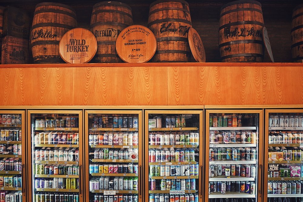
Founded in 1983, Warehouse Liquors has been a staple in downtown Chicago for 40 years. They offer weekly tastings and have a knowledgable staff which have helped them build a strong relationship with the community. While they offer a rare and exclusive assortment, they do not currently sell any product on their website.
RESEARCH & DISCOVERY
I focused my interviews on people who have purchased alcohol multiple times within the past year. I also wanted to split my user interviews to include a live walk-thru of the warehouse liquor website so I could see in real-time what people thought of the website when navigating and browsing. This exposed some major navigation and content opportunities.
“I do like the staff pick suggestions and when I go out to eat I ask my server for suggestions or staff favorite”
Annie - Medical Sales Professional
“I didn’t ask anyone for help, but I am a big fan of reading the staff picks or the signs”
Jason - Product Manager
“ I picked up a few ingredients for some meals and I went thru the wine list looking for something that would pair”
Rachel - Airbnb Host
“people leave a lot of reviews on total wine, they are nice to look at and read”
George - UX Designer
After finishing the interviews and gathering all the data I completed a card sorting exercise in order to ensure I would be grouping the inventory of products in appropriate categories based on user feedback. The consistent themes from user interviews, card sorting, and current website usability testing are listed below:
Users want to see reviews and ratings
Users want to see food pairing suggestions
Users want to see staff picks
Users want to see product descriptions so they can make an educated decision
User Interviews
Users accept the fact that products can and should be double displayed
Categories are intuitive until you get to accessories and misc items
Card Sorting
The global navigation is confusing
Lots of YouTube links on home page but not much content within the other pages
Tastings tab and warehouse tab seem duplicative, lack information
Usability Testing
USER PERSONAS
Once I synthesized my affinity map insights, card sorting results, and usability testing, I created the primary and secondary persona based on their goals & motivations.
Primary Persona
Secondary Persona
THE PROBLEM
The user needs a way to purchase products online at Warehouse Liquors while being able to view customer reviews and detailed product descriptions so he can make an educated purchase.
THE SOLUTION
E-comm functionality with user reviews and food pairing suggestions.
COMPETITIVE ANALYSIS
I wanted to research and analyze not only the direct competitors to Warehouse Liquors but I also wanted to look at how other companies displayed user reviews, product display pages, and the checkout page. Below are a few of my observations:
DEVELOP & SKETCH
Now that I have user feedback, details about my competitors, and developed the user persona’s I wanted to look at updating the sitemap before I started sketching. I wanted to prioritize the sitemap since I received consistent feedback during user interviews about the sites global navigation being overwhelming and confusing, with too many options. Specifically, the current navigation has 9 categories and I was able to retain all of the current information while simplifying to only 3 category options.
I hit the sketch pad and started ideating what the home screen could look like. Next I created greyscale wireframes of the home screen, product display page, and checkout page. I continued on by adding images and creating my prototype relationships so I could begin usability testing.
USABILITY TESTING & FEEDBACK
After finishing my wireframes and creating the prototype relationships, I began usability testing for the following task: “Shop for Macallan Whiskey, add it to your cart, purchase it, and leave a review of the product"
While the usability testing resulted in a 100% success rate, there were 3 key takeaways from usability testing where users gave feedback on the experience:
Users expressed the need for a back option while navigating the website,
Users wanted an “x” option on the popup screens to give them another option other than the CTA buttons, which is familiar for most apps and website pop-ups
Users wanted an “x” option on the popup screens to give them another option other than the CTA buttons, which is familiar for most apps and website pop-ups
LEARNINGS & NEXT STEPS
I learned that if you’re updating an existing website, it’s important to include early rounds of usability testing in order to get feedback on the current website before making any updates. I included an early round of usability testing in combination with my usability interviews. I made it three simple steps: 1) browse the homepage and tell me your thoughts 2) explore the global navigation links and tell me your thoughts 3) what would you change that we have not discussed… gathering this information early allowed me to maximize my time during the usability interviews.
For next steps, I would continue to build out the product review and food pairing section. I would also want to work with the engineering team on developing an algorithm for suggesting similar items on the Product Display Page.


